Recent Posts

Tuesday, April 30, 2013

The Legacy of the Civil War


This summer marks the 150th anniversary of the Battle of Gettysburg. In honor of that milestone, The University of Rochester takes a look at the legacy of the civil war as well as the alumni who fought to defend the union in the current issue of Rochester Review. Editor Scott Hauser very easily could have opted for historical photos for this issue, but instead wanted something original and different. As a history nerd, I was more than happy to provide it.

Below, some art that appears on the inside:


The  first article argues that the war that the sacrifices made on the battlefield were absolutely necessary for creating the nation we live in today. The author goes on to argue that any option other than the unconditional surrender of the south would have resulted in a much different nation, one in which slavery likely would have persisted until the 20th century.


Frederick Douglass, who lived in Rochester for 25 years and is buried a short distance from the University of Rochester's campus. I don't get asked to do portraits that often. This was a nice challenge and change of pace.


The second story tracks University of Rochester students and alumni who fought at Gettysburg. The insignia on the buttons is the U of R seal.

Bull market: too big to fail?


I enjoy doing these Business section covers for the LA Times as its a challenge to work in the vertical format, and I also enjoy seeing my work larger than the usual 8x10 (or smaller) magazine format. Yes, its pure vanity, but then I have always hypothesized that any artist's true motive is to be noticed. And we're getting off topic. Anyway, Derek's article dealt with how our current economic prosperity is based largely upon performance of the stock market.

Excerpt from Derek's email:

"Stocks' bull market: Too big to fail?
Fed Chairman Ben Bernanke officially isn't supposed to worry about the stock market. But his hopes of keeping the economic recovery going may now depend in large part on whether he can keep the bull market going... So as stocks have faltered in recent days, Wall Street has begun to face up to two difficult questions: How great a danger do investors face of another bear market soon? And is there more that central banks can -- and would -- do to boost the chances of sustained longevity for the four-year-old bull market?"

Sketches:

Portraying economic prosperity based upon the bull market as horns based on bull's head.


What could happen if the market drops: dead bull. In hindsight, the arrow should be a crack in the skull.


Taking steps to protect the bull market.


Economic prosperity built on the back of a rearing bull market. Probably the worst bull drawing I've ever done.

Final art in context. Derek requested the horns from sketch #1 be incorporated into the image:
This assignment really got me thinking about what could happen in the coming years: Will we be "bailing out" large businesses, too?

Thanks for reading!

Enjoy the Day,
Chris

Closing down mental aid


Here is a breakdown of a recent City Pages cover I did with Mike Kooiman as his last job before moving on to greener pastures. Best of luck, Mike!

Excerpt from Mike's email:

"It's about the Apollo mental health facility that's closing and leaving patients stranded. Simple as that. What sucks is we JUST did another mental health story, attaching the cover. So this one can't focus on a head or brain."

Sketches:

I thought this would be interesting since the closing is a "hard pill to swallow" for both patients and for medical staff. I liked the image as the viewer doesn't know if the doctor is giving or receiving the capsule.

Now I know this image has brains in it, but I thought it was ok to submit since they were a subtle aspect of the image. I was looking forward to taking this one to finish if selected, but I think it was too negative. (But I would have used bright colors...)

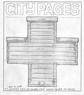
The phrase "shuttering it's doors" was used a few times in the article as well as in the sub-head, and so   I thought those doors in the shape of a first-aid symbol would make for a fun cover that changes when viewed far away and up close (as most weekly papers are in newspaper boxes on the street corners). In hindsight, it would be really messed up if there were an accident, and then someone saw this down the street and thought "What luck! A first aid kit!" They run to it, and then they find its just...the paper?

Oh well. The final:

Mike went with the aid symbol, and I think it made for a simple interesting cover. Thanks to Tom for the tearsheet and for filling in for Mike after his departure.

I played with this a bit, and I hope it doesn't offend the art directors involved. I thought the effect would be more successful with lightened text? But I understand that it needs to be an easy read for folks passing by:


Thanks for reading!

Enjoy the Day,
Chris

Thursday, April 11, 2013

Spectrum 20


It was a shock to receive word that this piece, "Night Upon the Mountain", was accepted into Spectrum 20.  At the beginning of this year when I decided to commit myself fully to building a fantasy/sci-fi portfolio and pursue work in that field I had no timeline for success, knowing full well that it could take me years to gain a foothold in the industry.  I was (and am) okay with this, as through editorial work and teaching I have just enough financial security to focus on growing my skills with these pieces and trying to become better with each one and to develop my personal voice through the learning process.  This was the sixth piece I made in that initial portfolio, and have since then made 28 more, almost completely replacing that initial group.  I have never had more fun working and to have a piece in Spectrum, long a dream of mine, seems totally unreal.  Thank you so much to the judges for helping me realize this dream.
Part of the process that I've developed, and that I hope brings that personal voice into this work, is that in working digitally I decided early on to rarely if ever use "stock" textures for my work.  99.9% of what I use I make myself (with acrylic paint or printing ink), or steal from previous "gallery" pieces I've done (such as the work for "Yugen", my two-man show with Edward Kinsella).  For this piece, the special sauce was a portrait of a good friend, Will Godwin, that I had done as a gift for him, using house paint, printing ink, oil paint, wax, crayons, and roofing tar.  Thanks for lending me your subliminal magnetism, Will - in person or in a photoshop layer, you have a power few can resist.


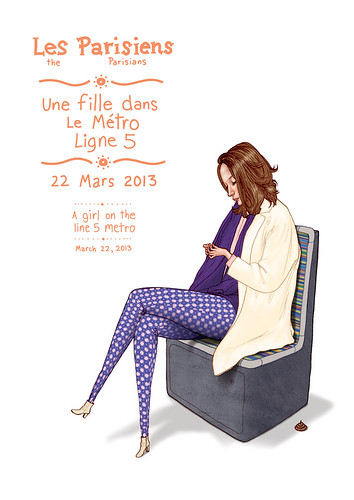
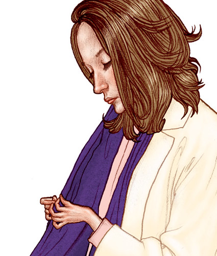
Ligne 5 Metro Fille - Jason Raish


Another one for my Parisians project.  Une fille dans le Metro ligne 5 ( a girl on the line 5 metro)


Wednesday, April 10, 2013

Spectrum 20

This year's Spectrum judges deemed this image worthy of inclusion.  
Pretty awesome to be included again, looking forward to seeing the book!

...and the book is available here {ahem}    https://itunes.apple.com/us/app/the-waking-prince/id582084676?mt=8

Tuesday, April 9, 2013

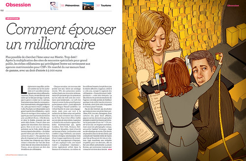
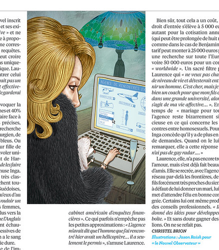
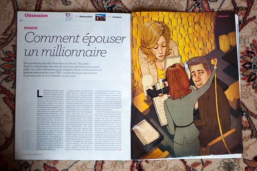
Mon prémiere travail en France (my first job in france) - Jason Raish

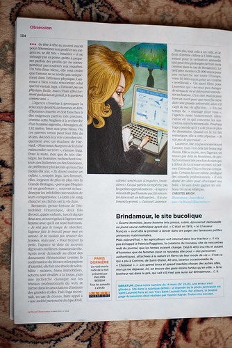
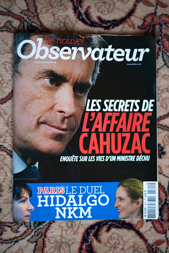
Mon prémiere travail en France. my first job in france. Le Nouvel Observateur is one of the biggest new magazines in France.  I did a full page and a spot illustration for them.  emails and communication were in french so it really was a "french" job.  story is about dating services for the rich.  There is one that is 5,000 euros to join.  some of the clients make crazy requests like they must be 1 meter 82 centimers, Argentine, a surgeon, own a helicopter, graduated from Harvard, etc....


Friday, April 5, 2013

More sneak peeks at A Brain Is For Eating


Hitting crunch time on this, here are a couple newly finished illustrations for A Brain Is For Eating. Enjoy!
-S

Thursday, April 4, 2013

Chickadee 'Green Power'

Thanks to the nice folks over at Owl magazine for giving me the cover of Chickadee’s April issue!

The cover’s theme was ‘green heroes’, and the mag pretty much knew what they wanted, and gave me a pretty awesome rough to work from. It was a bit challenging to fit in more ‘green’ elements considering the subheads, callouts and barcode box (bottom left, not shown here). Hopefully it gets the general idea across.

Wednesday, April 3, 2013

Les Parisiens - Centre Pompidou Conservateur - Jason Raish

Les Parisiens (the Parisians) A new personal project:  illustrating select people that I see around Paris.  Here is a curator in the Pompidou Center.  Un nouveau projet personnel:  Dessiner une sélection des gens que je vois autour de Paris.  Voici un conservateur dans le Centre Pompidou.


The New Yorker - Nick Cave & the Bad Seeds


I did a portrait of Nick Cave & the Bad Seeds for last week's issue of the New Yorker.  This was a dream job in many ways for me.  Before becoming an illustrator I was a musician (with the Philadelphia-based band National Eye), and Nick Cave has always been one of my favorite artists.  I love how his voice comes through in whatever he does, whether one of his musical projects or in his writing of novels and films.  My first memory on getting the job was going at midnight with my friend Rick to get a copy of "The Boatman's Call" when it was released and listening to it over and over.  I had actually been listening to his new album "Push The Sky Away" almost non-stop for two weeks when I got the call for this.

Another reason this was a dream job for me was that I got to work with AD Jordan Awan, a great illustrator in his own right.  When I first started promoting my work he was one of the few AD's who wrote back to me.  He even took the time to let me know which pieces of mine he liked, and which pages of my sketchbooks he enjoyed, suggesting that I perhaps push my artwork in those more personal directions.  As my artwork changed and evolved over the last two years of professional work, he would occasionally send me a note of encouragement.  So often in making and promoting illustration work it feels like you are shouting into emptiness, so those small acts of his meant a huge deal to me, and gave me the courage and conviction to continue pushing towards a more personal, honest voice in my work. 

Even though it was a pretty quick turnaround, I did 43 thumbnails for the job, wanting to nail it.  I ended up sending Jordan 6 that I thought would work.  Below are three, including the one we ended up going with.  And again, thank you, Jordan. 


Tuesday, April 2, 2013

Cal State Chico's Drinking Problem


Here is a quick-turnaround, cover job for the Chico News & Review. Cal Satate-Chico has a reputation as a party school. In the last year, binge drinking has led to four student deaths as well as a slew of other problems ranging from vandalism to sexual assault. This week the alt-weekly takes a look at the way other universities and college towns have dealt with similar problems.