


Recent Posts
Friday, December 24, 2010
Monday, December 20, 2010
Saint November
 Recently I was asked to create the mascot for his new label for music, art, and more on the Restless Coast in the south of the UK. always happy to collaborate with like minded individuals, and eager to help a fan & friend from across the pond, i jumped at the chance.
sketches (on the plane from Florida)

black & white studies, because any logo needs to look great in stark B&W

color studies to see where he wanted to go:

a variation on the final, with some watercolor on top of the digital inking
(feel free to click on any of these for a larger view)
 keep an eye out for all the amazing things Liam and St. November are doing HERE!
Happy Holidays!
-pw!
Thursday, December 16, 2010
TAX ATTACKS
Hello Everyone,
The past few weeks have been extremely busy. A new wave of projects poured in after Thanksgiving and I wasn't quite able to keep up with the daily drawings. I just finished my first assignment which was a full page illustration for Military Officer Magazine. It's a continuation of the Super Hero series which has been on halt for a while. This time it was for an article that talked about the many new changes to our tax programs in 2011.

This piece was extremely fun to ink. I was going with a more traditional comic book style and tried hard to give the lines a more natural look while still using the Wacom tablet.

The selected concept was in reference to H. G. Wells' War of the Worlds. The inked image below was another concept I might finish for myself another time as I'm somewhat happy with the overall composition and perspective. With this alternate concept , I wanted to give the hero an actual nemesis that could portray the taxes rather than having him always battling papers and numbers. Since this might essentially take away from the reading too much, we decided to go with the idea above.

The last idea was referencing Atlas from Greek Mythology. At first, I thought this was a good way to show tension and struggle with the weight, but it simply didn't work well for this article and was compositionally very weak.

Lastly, I wanted to create a Super Hero character that would be used for all future articles since this is an ongoing series. Giving the publication its own character would create more consistency since the images are usually linked to tax related articles. I have not received any feedback about the reuse of this particular design, but maybe it is too boring showing the same figure flying around every time. Either way, I want to thank Jill for keeping this series going and allowing me to be experimental with my work.

Thanks for stopping by guys,
-Tin
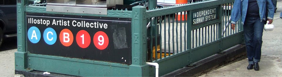
vegan treats
 just keepin it simple for VeganTreats.com
some other merchandise i designed (great gifts this season) HERE
thank you
-pw!
Wednesday, December 8, 2010
Japanese New Year's Greetings
Happy Holidays and Happy New year! (Japanese style)
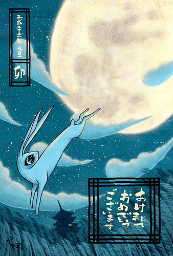
Here is my take on a Japanese new year's card (nengajo, 年賀状). Traditionally they feature the Asian zodiac animal of that year, 2011 is the year of the rabbit. Throughout Asia, because of an old story, it is believed that there is a rabbit on the moon (instead of a man on the moon). Basically the bottom says Happy New Year and the top says 2011 and the final box below that is the character for rabbit. This time last year i was laying in a hospital bed in Tokyo after having no memory of being hit by a taxi and receiving a fractured skull. So I beg of you, Please enjoy your time with your family and friends and get the most from your life! Happy Holidays and Happy New Year from the land of the rising sun! Oh and this is 100% paint, no photoshop hooray.
-jason
Tuesday, December 7, 2010
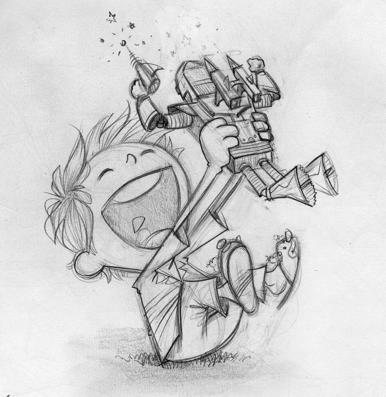
SAMUS ARAN

The first time I played Super Metroid on the Super Nintendo I was determined to become a concept artist for a video game company. I was in love with the design of the character, the many different creatures and the game's environments. Visually, it was pushing all boundaries of what I previously experienced in a video game. This particular shot was inspired by the last level of Super Metroid, which I recall being a pain in the butt to beat.
While I don't remember every detail of the level, I remember running against the clock after defeating the last boss and trying to find my way back to Samus' space ship.
Today, I work as an illustrator and am still pursuing that childhood dream of working on a video game as a concept artist. While there were many jobs in the past that required me to illustrate video game characters, I am still deeply inspired my Mike Sneath and his designs and would love to open a new career path towards the gaming industry.
Stylistically, I've been recently very inspired by Marcos Mateu-Mestre.
I love the energy in his drawings and his wild and instinctively controlled line work. I had a lot of fun with distorting the perspective and playing with custom brushes that looked like chisel tip markers.

Thanks for viewing guys and Happy Thanksgiving!
-Tin
Monday, December 6, 2010
Rafflesia Factoid
I recently finished the artwork below for Richard Solomon's "Factoid" poster project.
My illustrated fact concerned the Rafflesia, the world's largest flower. Found in and around Malaysia, the flower gives off an unusual odor - hence its nickname the "meat flower." With that in mind, I felt the Malayan Tiger was an attractive and sensible element to use in the image.
 The assignment was altered to call for black and white, but I originally envisioned this as a color piece as some of my submitted sketches show. Despite this change, the project was a lot of fun from the very start.


Thanks,
Doug
My illustrated fact concerned the Rafflesia, the world's largest flower. Found in and around Malaysia, the flower gives off an unusual odor - hence its nickname the "meat flower." With that in mind, I felt the Malayan Tiger was an attractive and sensible element to use in the image.


Thanks,
Doug
Friday, December 3, 2010
Playtime!

(click for larger image)
This friday in Philadelphia, December 3rd, altruistic designer Mat Kerfren & the Autumn Society brings holiday cheer with "Playtime", a fantastic charity show dedicated to raising money for Toys For Tots.
i was initially asked to illustrate the "sheer joy in receiving a toy" for the flyer and advertisements. well it was a real joy to illustrate joy here.
the flyer, designed by Mat Kerfren:

thanks for reading and happy holidays!
-pw!
Thursday, December 2, 2010
Phobias Book Singapore
A big 20" x 20" illustration for Kult design agency in Singapore. Its for a book about fears. my assigned fear was Gephydrophobia - (Fear of crossing bridges). Some people with this affliction imagine monsters under the bridges they must cross. I thought this would a great time to illustration some Japanese themed stuff i've been wanting to draw. this illo almost didnt happen. That bridge took like 8 hours to complete and i had to do it all over again because the photoshop file got corrupted when i was halfway done with the whole illustration! then my keyboard stopped working and more time was wasted finding the fix for that. This is acrylic paint, pencil, japanese patterned paper, chinese ink, and photoshop. I used a sponge for the tree leaves and moss. What a monster it was completing this. I'm sorry to say I logged 60+ hours on this one.

I have seen all this stuff while living in Japan, except for the monsters of course. Jizo are little stone statues that are the protectors of travellers and children. they often are decorated with red clothing. Ravens are bad omens. There is a whole encyclopedia of Japanese monsters (Yokai). Here are 6 (and a raven, so i guess this continues my Japanese crow series too). They are all based on the original Japanese design but with my twist of course. I sourced some real life disturbing looking animals for some of these. The melting face guy in the back is based on a blob fish (truly disturbing). The red oni is based on a Chinese girl in my Japanese class hahaha. the bug eyed furry guy is based on a Tarsier (some kind of monkey with huuuuge eyes). The guy on the upper left is a Hitotsume-kozo (one eyed monster that resembles a bald Buddhist priest)

an umi bozu (sea monster)

a Suushi Nuppeppo (animated lump of decaying human flesh), a Kijimuna (a forest sprite from Okinawa). All Yokai have crazy stories that are super strange and intersting to me as a westerner, for example the Kijimuna bug-eyed monster on the right, here is an excerpt "a kijimuna may offer to carry a human on it's back as it leaps through the mountains and over the seas. The kijimuna dislike people passing gas on their backs, however, and will immediately throw the human off their backs, no matter where they were at the moment."

Seen here is a kappa (turtle like thing that will do bad things to you but has a hole in his head with water in it so if you bow to him he must bow to you therefore losing the water in his head and disabling him so you can run away), an oni (demon/ogre, you throw beans at people wearing these masks on setsubun day)

awesome japanese papers i found at various stores for the kimono.

and one final thing you didn't want to see. After 3 days of not shaving and not very much hygiene I was dead but had met the deadline. why do i always make these things so complex so i have to work 16 hrs a day on them?
I have seen all this stuff while living in Japan, except for the monsters of course. Jizo are little stone statues that are the protectors of travellers and children. they often are decorated with red clothing. Ravens are bad omens. There is a whole encyclopedia of Japanese monsters (Yokai). Here are 6 (and a raven, so i guess this continues my Japanese crow series too). They are all based on the original Japanese design but with my twist of course. I sourced some real life disturbing looking animals for some of these. The melting face guy in the back is based on a blob fish (truly disturbing). The red oni is based on a Chinese girl in my Japanese class hahaha. the bug eyed furry guy is based on a Tarsier (some kind of monkey with huuuuge eyes). The guy on the upper left is a Hitotsume-kozo (one eyed monster that resembles a bald Buddhist priest)
an umi bozu (sea monster)
a Suushi Nuppeppo (animated lump of decaying human flesh), a Kijimuna (a forest sprite from Okinawa). All Yokai have crazy stories that are super strange and intersting to me as a westerner, for example the Kijimuna bug-eyed monster on the right, here is an excerpt "a kijimuna may offer to carry a human on it's back as it leaps through the mountains and over the seas. The kijimuna dislike people passing gas on their backs, however, and will immediately throw the human off their backs, no matter where they were at the moment."
Seen here is a kappa (turtle like thing that will do bad things to you but has a hole in his head with water in it so if you bow to him he must bow to you therefore losing the water in his head and disabling him so you can run away), an oni (demon/ogre, you throw beans at people wearing these masks on setsubun day)
awesome japanese papers i found at various stores for the kimono.
and one final thing you didn't want to see. After 3 days of not shaving and not very much hygiene I was dead but had met the deadline. why do i always make these things so complex so i have to work 16 hrs a day on them?
A Factoid
I was invited to participate in a fun project illustrating a factoid, like one you'd find under a Snapple bottle. I ended up with "Tigers have striped skin, not just striped fur."
Here is what I came up with...sparing you all the bad drawings of tigers I made before I found my animal anatomy book.
 And here's a figure painting from last night. I'm not sure if I love or hate Yupo paper, but the results are always interesting.

...and that wraps up my bite-sized blogpost spree. Hope you all enjoyed. Now I must return to hibernation.
-S
Here is what I came up with...sparing you all the bad drawings of tigers I made before I found my animal anatomy book.


...and that wraps up my bite-sized blogpost spree. Hope you all enjoyed. Now I must return to hibernation.
-S
Wednesday, December 1, 2010
Sketchdump with some extras


 |
| I wish I could claim to draw these ladies this well outta my head, but no. Alas, I was soaking up some Gerald Brom paintings. |


-S
Tuesday, November 30, 2010
Variety is the Spice of Life
Hi! thought i would post some of the fun things i worked on this November


 thanks!
----------------
the first is a possible pin-up for Image Comics' "Sullivan's Sluggers":

15 foot backdrop to be displayed on stage:

and accompanying "scrims" for the sides of the stage:

1 of 3 shirt designs for band on their UK tour. i wanted the letters to show various dimensions:

new logo for punk country duo "Coffee Project":

poster for a benefit concert for homeless youth of Philadelphia:

tribute for gallery show dedicated to tattoo artist Sailor Jerry:

and this was done to accompany a story for modern horror "radio" program "Dead of Night":
 thanks!
-peter
The Deal
While I was at the American Illustration party, I ran into an old acquaintance. Larry Gendron worked with my former boss/current rep, Richard Solomon, loads of times while I was Richard's assistant. Everytime it was a different hero of mine producing a great image for Larry's magazine, The Deal. Well, Larry was nice enough to let me show off my bit of art on the AI wall and told me he'd be in touch.
Wouldn't you know he had an assignment for me three days later. I received an email with an abstract detailing the unsteady financial future of colleges and universities. Larry encouraged me to push the "unsteady" aspect of the piece and have fun with it...


 ..so did. And Larry picked my favorite as well.
And in context...
 A big thanks to Larry Gendron for the opportunity.
-S
Wouldn't you know he had an assignment for me three days later. I received an email with an abstract detailing the unsteady financial future of colleges and universities. Larry encouraged me to push the "unsteady" aspect of the piece and have fun with it...


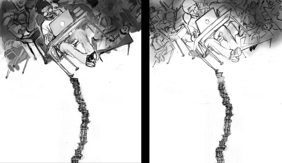 |
| Left is the refined sketch with some PS value added. The right is a clean line final that I find I need for the more complex images I create. This is apparently old news for many illustrators, but I tend to do a lot of things the hard way. |
 |
| Really happy with this finish (a true rarity nowadays) and I think it's simply because of the shine on the coins. How sad is that? |

-S
Subscribe to:
Posts (Atom)

