Recent Posts

Wednesday, March 31, 2010

Sketch Exploration 8- Edward Kinsella

Ted is taking it up a notch (or five):


See more of Ted's sketches on his personal blog (click).
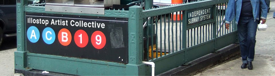
-Illostop

Character Commissions- Doug Cowan


April is looking to have some projects similar to this past month's as well as a few different ones. In the meantime, here are a few commissioned sketches of various characters I've recently done.

Thanks,
Doug

Coffe Project Continued- Peter Wonsowski

Paper+Plastick's COFFEE PROJECT (featuring members of Less Than Jake & Rehasher) asked if i would do the art and layout for their second record, and what a compliment to be asked a second time!

they said they wanted "Peter Wonsowski meets Dr Seuss"; how great is that to hear?!? and of course i love that my job includes a morning reading 7 of my favorite Dr Seuss story books for, you know, "reference" (not to mention my trip to the book store a Tax Write Off !)

the following were rough thumbnail sketches, to determine what kind of perspective we wanted:


followed by some quick fleshing out before i dove into the exploration of the final:


and since many drawings would be of actual band members, guest musicians, friends, and such, i drew pages of quick caricatures to get decent stylized likenesses. Here's Jake:


and the first [el Greco] version of Keeth, their friend (and parade's pied piper)


the Final Art (type and layout still in progress) PLEASE CLICK FOR LARGER VIEWS !


DETAILS:
i can't tell you how excited i was to do a complicated crowd scene. i wanted to make sure that there was always something fun look at, and i refused to oversimplify any bodies in the background. thankfully the divine format of a gatefold vinyl allows for 24"x12" to enjoy (so feel free to click for larger views!)


i'll let you know when it's available for purchase, especially on Coffee Project's tour this spring/summer !
thanks!
-peter

Tuesday, March 23, 2010

0-60 Magazine- Tin Salamunic (Tutorial!)

Editorial illustration for {0-60} Magazine.


:: shot of the color study/sketch that I submit to the client ::

:: Here is the other sketch that I submitted + color study ::


Communication Arts 51- Jason Raish


My huge 3' x 2' Illustration for Tiger Beer won a spot in the Communication Arts 51 Illustration Annual. A first for me, finally!

This was for Tiger Beer. They invited me to be a part of their "Tiger Translate" artist series that they have every so often. It is the biggest physical size i've ever done. it's 3 feet by 2 feet. Printed out this is a beaut. This year's tiger translate theme Change/Society. This piece is about losing culture. Here is my little statement: "Since I’ve been living in China I have been attracted to tiger hats and tiger toys for children because these representations of tigers are very different than western interpretations. In Chinese culture the tiger hat is meant to protect children from evil spirits and other bad things. I thought the tiger hat would be perfect for this concept because it is supposed to protect the boy yet it needs the boy to protect it from becoming another forgotten tradition. This made me think about how culture is always changing resulting in old traditions being lost. As an artist I am saddened by the loss of visual culture, such as these tiger hats. The orange tigers represent some of the ways culture is lost. A lot of my friends' immigrant parents withheld their culture from their children to westernize the children thinking it would give them a better life. Some people reject their culture or it could be forcibly taken and outlawed. It could be bastardized, commercialized or watered down. These are represented by different tigers in this illustration. Behind it all this piece has a positive message. The hat is a cultural icon that you can physically see but it also represents the boy's culture as a whole, a symbol of what he needs to protect. It's tied firmly to his head, giving us hope that he will be one of the few that preserves his cultural heritage."

I'm working on 3 more of these to make a nice series. they take a long time so we'll see how far i get into this. I brainstormed on this piece for weeks so i had some other really good concepts that I wanted to do as well.

Tor.com's Pi Day- Scott Brundage

I worked for Steven Brodner for a while when I first moved to NYC. Among the many things I learned while helping out in his Studio were two very wise quotes that stuck with me....

1: The most important drawing is the next drawing.
2: If the wine is no good, throw it out!

Both are basically his philosophy on work ethic. I'd watch him eat a stack of paper making sketches for a single likeness, most of which I'd drool over, but he knew his standard and wouldn't settle. He also was a believer in not falling in love with a drawing if it wasn't the right one.

Now here is a story of me not heeding this advice.

Normally when creating a rollover I have a plethora of imagery to think about and skew to my whim. Usually a holiday is associated with its own managerie of icons, mascots and folklore. This time, however, I was tasked to create something for the obscure "Pi Day" (aka 3/14) celebrated by math fans everywhere (or maybe just MIT.) So, what do I have for Pi Day? The irrational number starting with 3.14 and the symbol π. I had to relate it to something Tor.com would be interested in, so something scifi/fantasy/literary/comic booky. I thought something that was a classic riddle in stories could rollover to reveal the shapes in π. My buddy, Frank, mentioned the Mad Hatter's Riddle "How is a raven like a writing table?" which is a riddle with no answer (the Mad Hatter is mad). Seemed like a good excuse to do an Alice illustration.

My first clue that I was on the wrong track should have been that I'd never heard of that riddle.

But I went for it.
I tried to figure out how I'd like to show the scene of him asking the riddle. Something that wasn't too obviously inspired by Tenniel andRackham.


Then I played with the shapes of π and ravens and desks to get them to be somewhat similar.
And I had the great idea of framing the drawing in cards. But ho! The cards are in order of Pi's digits!
I got to about this stage before I realized that the idea was bad. Very bad. Only a handful of people would understand what was happening, and the fact that the table and raven looked like π didn't actually mean anything.

So... even after committing to paint every-effing-one of those cards accurately, I knew it was toast. I had to start completely anew. (notice the creases from when I threw the painting out, only to dig it out of the trash to blog about the experience)

Now, with much less time to work, I rethought my whole Pi dilemma. In about three seconds I realized the word Pi was extremely accessible and had a much better idea involving the Pied Piper.

Moral of the story: Don't fall in love with an image if you know it isn't the right one. A pretty illustration that makes no sense is a bad illustration.

-Scott

Friday, March 12, 2010

Satar Wars Galaxy 5: Darth Vader & Darth Maul- Doug Cowan

This is the third and final illustration I did for Topps' Star Wars Galaxy 5 card set. Like my previous Luke Skywalker card, this is an off-screen scene that occurs during The Empire Strikes Back. The reverse side of the card features my sketch and a short quote that describes the scene:
The painting below is the second of three done for Topps' Star Wars Galaxy 5 card set. The scene depicts Darth Maul, standing before the rear loading bay doors of his ship. The reverse side of the card features an earlier sketch and a short quote:


-Doug

Tor.com Valentine's Day Animation- Scott Brundage

Another holiday rollover for Tor, this time addressing Valentine's Day.

A lot of these holidays are fun to explore because of the either traditional or completely commercial imagery associated with them. Valentine's has a great variety of love, religion, and hallmark-ish symbols and images to choose from. I figured the most fun to paint would be cherubs or cupids following lovers in a very saccarine sweet scene of whimsical romance. I could avoid doing anything using hearts or chocolates that would have been a lil obvious.

So... even picturing possibilities in my head, I started thinking of Rococo style painter, Fragonard. He is primarily famous for (what I consider) over the top romantic paintings. Rosy cheeked men fawning over plump women with enormous dresses in flattering sideways light, in the middle of a lush garden. Adorable.

Beautiful, and very very ridiculous. So, one goal was to attempt to reach that level of overthetop ridiculosity. I started figuring out poses that would be graceful and flowing to see what possibilities would lie in the shapes. I quickly found that the cherubs would easily translate to flying monkeys, and with such an opportunity, I had to make the rollover involve the Wizard of Oz.
Narrowing down the scene a bit more to what I really wanted to show, thinking what could possibly relate to the rollover image, I settled on a carefree lover's chase. Cherubs circling above, aiming arrows of love.

Some tracing paper and photoshop magice later, I had my translation to the world of Oz.
And painted the finish.


... and another heartwarming image to leave you with.

-Scott

Wednesday, March 10, 2010

BM Savings- Jason Raish


These were black and white comps done for BM Savings in the UK. They were done Via DLKW, and agency in London. After they first round they came back and said they wanted to commision a new set of comps with older guys, 30, 40, and 50 yrs old, dressed more smart casual rather than slick suits. I never heard the results even after asking. I looked today and saw that they ended up going with the agency's comp which was exactly the same red carpet background with a black clipart silhouette of a guy walking. How sad. Thus is the world of advertising. Thanks Marion for calling me though.


-Jason

Star Wars Galaxy 5 Luke Skywalker- Doug Cowan

This is one of three new illustrations I did for Topps' Star Wars Galaxy 5 card set. Below is the initial sketch selected from the group in my previous post. I've also included a second, refined version that was done before I painted the final image.
-Doug

Friday, March 5, 2010

Sketch Exploration 7- Edward Kinsella

Mask sketches for a series of personal illustrations I'm working on. I'll post more on this as it progresses.


I think I'm going to rename this blog "drawings of me and cups". Seriously though...I'm drawing new things starting now.

-Edward

Earth: Fragile Planet (SOI)- Francis Vallejo


Hey folks! Here's a small painting (5x 15in. ink and gouache on paper) I created for the Society of Illustrators. It's for the show Earth: Fragile Planetto raise awareness for issues affecting the environment. This is especially timely with the recent onslaught of natural disasters around the globe.

I wanted to test myself, and see how simple I could go with this one. I have a chronic tendency to over complicate my pictures, so this was a fun experiment!

The show is not until June 3rd though, so when more information is available I'll pass it along.

cheers!
-fv

Sketch Experiments- Doug Cowan


I recently completed this drawing between projects. This is the fourth image in a series I've been working on for fun, focusing on a deep-sea diver.

To vary themes, I introduced some action this time around. My initial pool of sketches has two remaining images, both of which I will finish when time permits.

These are the pencil drawings I used as a basis for my final ink drawing:


Thanks,
Doug

Sketch Exploration 2 (Johnny Cash)- Peter Wonsowski


Tuesday, March 2, 2010

Alfred Hitchcock Magazine- Ed Kinsella


New illustration for Alfred Hitchcock Mystery Magazine. I also just added some new pages to my sketchblog.

Sketches 4-Francis Vallejo


Some recent drawings. A page of Mignola copies in there. Can't believe March is around the corner...time is flying!

take care,
-francis

CSO, Radio Times, & Network World- Jason Raish


Spot for CSO magazine about biometrics. Conventional identifying traits include: fingerprints, face topography, iris structure, hand geometry, vein structure, voice, signature, and keystroke recognition. Emerging tech includes gait, odor, and even ear shape.
Spot for the Radio Times in the UK for a play called "Not Bobby". its about a mum and her son and a rabbit that he brings home that can complete crossword puzzles. the son is played by Mackenzie Crook (The Office, UK version). i am glad the art director went with my crazy off the wall idea with the giant rabbit.
Spot illo for Network world about becoming a data center top dog.

Star Wars Insider- Doug Cowan

Two of my Star Wars Galaxy 5 sketches are published in the current issue of Star Wars Insider ( issue #115).
Other artists included in the feature are Cliff Chiang, Adam Hughes, Stephane Roux, David Rabbitte, Jerry Vanderstelt, Katie Cook, Grant Gould and Bruce Timm.

Thanks,
Doug