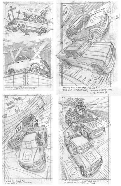
To start off, this assignment had nothing to do with Jesus. It was a request from the wonderful Ivylise that I combine football player personalities with cars reflecting their names for an article titled "CarToons;" here's an example: Mark Sanchez (Jets quarterback) + Lincoln Mark LT (a pickup truck) = Lincoln Mark LT Sanchez. Being a Jets-themed article, the other car was based on Jets QB Tim Tebow (Jeep Liberty + Tim Tebow = Jeep Libertebow). Ivylise granted freedom to sketch whatever I wanted, but to avoid a previous illustrator's "dated" technique of putting faces, jewelry, etc on the cars.
This was a tough assignment. Everything I drew felt obvious and non-conceptual. While I was enjoying drawing the vehicles and trying to make them a bit chunky/cartoony, I was having trouble fitting elements into the cars and background that didn't feel forced. I should let you know that Tim Tebow is a very zealous Christian, and Mark Sanchez is of Mexican descent and loves Broadway theatre. So yeah, applying those to cars is an interesting exercise if you want to avoid cliches like Jesus-fish and little Mexican car-flags :)
After three sketches, while hating my ideas and being jealous of Spider-Man in the poster above my drawing space, I was running random thoughts through my head when I started playing with the word "cartoon" and seeing "cart" in there. This made me thing of go-karts and soapbox racers. Working this idea into a sketch, I was able to add in figures to represent aspects of the personalities that I was initially exploring in cliche reflections/backgrounds; doing so allowed the environment of a football field to represent the overall "football" theme. I guess, you could say my final (and favorite) sketch combined elements of others sketches with a more creative concept where the cars aren't really cars anymore...
Sketches:
Luckily, Ivylise and the editors didn't think my Mexican wrestler-Sanchez was racist, and my favorite sketch was selected! They requested a sketch revision of removing JC's wings and putting him in a "Tebow pose" which made sense.
Plus, its not like Jesus would need to actually steer as his car would be guided by divine forces, right?
I should note this is much more caricatured and "cartoony" than my usual work as I felt it would fit the silliness of the mash-ups. Also, I remembered the words of Mr. Tocchet, my professor at UArts: "Businessmen see businessmen all the time; they don't want to see businessmen doing things in an illustration." Now, that isn't always the case with publications in this field; but I thought it made sense to move away from realism for this assignment as people reading this automobile magazine are flipping thought 100 pages of car-photos.
Revision:
Folks say "green doesn't make for a good illustration." But sometimes it is whats you have to work with, especially when the Jets color is green and the football filed archetype is grass. Its a good exercise to work outside the comfort zone, and as an experiment I also prohibited myself from using red since it seems to dominate my portfolio (by request, I swear!) Ivylise didn't seem to mind, and I enjoy the result.
Final:
Details:
Enjoy the Day,
Chris


No comments:
Post a Comment