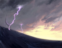
Recently I created a cover/ad materials for D&D's organized play release called Lair Assault: Talon of Umberlee. Unlike any other project I have worked on, I was tasked with creating an image that would be used not only for the print materials, but also for any other needed advertisement for the release. This meant, all the element in the image needed to be movable so that marketing could place items where they needed for various banners and things of that like. So, I had to paint everything on separate layers. I have never done anything like this before so I was some what at a loss on how to even approach it. I normally paint flat in Photoshop and Corel. I decided I would do an overall sketch of all the elements together as a composed image and then break them down and paint them out separately. It certainly took a lot of time but it was really fun. I worked with AD Kate Irwin on this one. Always a pleasure.
Here is the result:
This is a breakdown of how it all went and how each layer was placed in. It was really a challenge keeping everything in order and in the right place.
...and here is the final booklet.


4 comments:
The way google lets me slide through each step makes me hate how seemingly easy this was to create.
"I'll just add a badass environment here. A giant tentacle here with the appropriate lighting, and a pirate ship here. And now I'm done."
Please tell me I'm way off. This thing is too damn cool.
haha.....yeah you are way off man. I just showed each step as I turned on each layer. It was actually a huge pain painting each piece and making it work in the environment, simply because I usually work flat. So remember that it was a separate layer was a bit of a challenge. But I wanted to make it look easy....haha
I mean, wait, it was totally easy man.....
dude- this is great! Love your compositions in a huge way
Post a Comment