Recent Posts

Thursday, July 25, 2013

The New Yorker

Here are two recent pieces that I've done for The New Yorker.  
The first is about the genre of crime fiction novels based in Florida.  
The second piece is for and article that argues for the legitimacy of Sex And The City as a dynamic drama, not just a rom-com.  It shouldn't be overlooked next to crime-dramas like its peer, The Sopranos.
The portraits were a quite the challenge, but hopefully they're pretty close.


Wednesday, July 24, 2013

Digitally Spying Parents for Worth Magazine

Howdy! Here is a quick image I recently created for Worth magazine. It was great to work with an AD who was familiar with my work from the Alt-Weekly papers that basically jumpstarted my career as well as finally working with a magazine I've been trying to get my work into for years. The article was about how some parents hire private investigators to set up surveillance on their kids. This is usually done to protect them (bullying, drug use, etc), but it still brings up ethical issues...

Sketches:
I went for a pessimistic view of the subject matter as that seemed to be the nature of the article (and my own thoughts on the subject). No matter what age, who wants ANYONE accessing their private texts and phone calls. (Hello? Government? Are you listening?)

Final:


I wanted to play with fun juvenile colors while maintaing that dark ominous feel in the art. I submitted two versions (with and without the little trinket), and I was happy to hear this one was in the article.

Thanks for reading!

Enjoy the Day,
Chris

Tuesday, July 9, 2013

Lebron James for Nike - Jason Raish

Finally finished this piece. Nike T-shirt project that ended up getting killed. I did Kobe Bryant also. This was back in 2010 when he Lebron was with Cleveland Cavaliers. They wanted him to have his first shoe on, the "Nike Air Zoom Generation". This was what he looked like walking into the arena back then.  Here is Kobe


Wednesday, July 3, 2013

Trident Twist Packs- Chris Whetzel

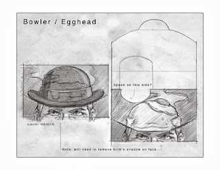
It is a pleasure to share some packaging I created recently for Trident Europe. They wanted some fun illustrations which would act as a sort of animation when the pack of gum was opened. Since the target demographic was kids/teens and the name of the product line is "Twist," they wanted a bit of a gag with colorful images. Working with the design agency, they provided the "jokes" and loose mocks of how they wanted the reveal to work. The concepts were code-named:

-Egghead
-Fishbowl
-Boxer
-Tent

Sample image from the brief:


Sketches:

(spoon to be added, soft-boiled)
(shark to be added)
(boxer to be added, uvula as speed bag)
("monster" eyes to be added)

Sketch revisions:

 (removed steam)
(more definition in molars)


Final art samples. Most were created in multiple color versions as there were three different flavors each with its own Pantone palette:


(watermelon)

 (strawberry)
(mint, before palette was altered as seen below)

And here's a mock of how it works and looks with logo placement:

Here are some packs the AD was kind enough to send:


The artwork is also used on larger cases of flavor packs (display boxes sold to retailers), and I even created some fruit illustrations to also be featured on the cases:


The packs seem well-received, and I'm hoping they decide to do more as the assignment was very fun. Thanks for reading!

Enjoy the Day,

Chris