The Obama White House is at war with leakers, according to The Washington Post. In an effort to stop would-be whistleblowers from disclosing classified information, the Department of Justice has been applying pressure to journalists. The administration has gone so far to prosecute some reporters using the World War I-era Espionage Act. Read the whole the whole story here. Art direction by Marianne Seregi.
Recent Posts
Monday, October 7, 2013
Wednesday, September 4, 2013
Education Assignments- Chris Whetzel
Here are a couple recent education assignments:
The first article deals with how education is currently focusing on the wrong areas. Apparently, a large emphasis is placed on HOW teachers approach their class material and not WHAT that material is; basically, teachers are being told: "Teach with this setup, test formats, etc; but you teachers decide what content students need for real-world application." Does anyone else see an issue with that approach?
It seems so as teachers and reformers are up in arms about it and how it makes for a non-unified education. There seems to be movement toward teachers collaborating across districts to create lesson plans that relate in an effort to improve a student's education.
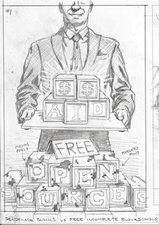
The second article deals with how schools are taking on learning management systems in an effort to streamline the various duties of teachers and the options they have for such systems. The article focuses mainly on open-source vs paid systems; open source is free but full of issues/bugs/lack of customer support, and the article favors spending a little for a better experience.
Thanks for reading!
Enjoy the Day,
Chris
The first article deals with how education is currently focusing on the wrong areas. Apparently, a large emphasis is placed on HOW teachers approach their class material and not WHAT that material is; basically, teachers are being told: "Teach with this setup, test formats, etc; but you teachers decide what content students need for real-world application." Does anyone else see an issue with that approach?
It seems so as teachers and reformers are up in arms about it and how it makes for a non-unified education. There seems to be movement toward teachers collaborating across districts to create lesson plans that relate in an effort to improve a student's education.
Sketches:
Solution: working together for a cohesive Common Core
Problem: non-defined content with only a focus on standardized testing goals
Situation: structure without content
Final:
The second article deals with how schools are taking on learning management systems in an effort to streamline the various duties of teachers and the options they have for such systems. The article focuses mainly on open-source vs paid systems; open source is free but full of issues/bugs/lack of customer support, and the article favors spending a little for a better experience.
Sketches:
Choice: Paid system served ready-to-go vs aid that is free but incomplete
Situation: Having to invest effort to avoid paying
Mutual partnership: companies helping teachers with workload
Final:
Thanks for reading!
Enjoy the Day,
Chris
Posted by
Chris Whetzel
Labels:
chris whetzel artwork
Thursday, August 8, 2013
Les Parisians - Sophisticated Lady
Posted by
Jason Raish
Labels:
jason raish artwork
Thursday, July 25, 2013
The New Yorker
Here are two recent pieces that I've done for The New Yorker.
The first is about the genre of crime fiction novels based in Florida.
The second piece is for and article that argues for the legitimacy of Sex And The City as a dynamic drama, not just a rom-com. It shouldn't be overlooked next to crime-dramas like its peer, The Sopranos.
The portraits were a quite the challenge, but hopefully they're pretty close.
Posted by
Leslie Herman
Labels:
Leslie Herman artwork
Wednesday, July 24, 2013
Digitally Spying Parents for Worth Magazine
Howdy! Here is a quick image I recently created for Worth magazine.
It was great to work with an AD who was familiar with my work from the
Alt-Weekly papers that basically jumpstarted my career as well as
finally working with a magazine I've been trying to get my work into for
years. The article was about how some parents hire private
investigators to set up surveillance on their kids. This is usually done
to protect them (bullying, drug use, etc), but it still brings up
ethical issues...
Sketches:
I went for a pessimistic view of the subject matter as that seemed to be the nature of the article (and my own thoughts on the subject). No matter what age, who wants ANYONE accessing their private texts and phone calls. (Hello? Government? Are you listening?)
Final:
I wanted to play with fun juvenile colors while maintaing that dark ominous feel in the art. I submitted two versions (with and without the little trinket), and I was happy to hear this one was in the article.
Thanks for reading!
Enjoy the Day,
Chris
Posted by
Chris Whetzel
Labels:
chris whetzel artwork
Tuesday, July 9, 2013
Lebron James for Nike - Jason Raish
 |
| Finally finished this piece. Nike T-shirt project that ended up getting killed. I did Kobe Bryant also. This was back in 2010 when he Lebron was with Cleveland Cavaliers. They wanted him to have his first shoe on, the "Nike Air Zoom Generation". This was what he looked like walking into the arena back then. Here is Kobe |
Posted by
Jason Raish
Labels:
jason raish artwork,
jason raish portfolio
Wednesday, July 3, 2013
Trident Twist Packs- Chris Whetzel
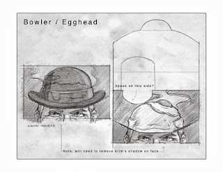
It is a pleasure to share some packaging I created recently for Trident Europe. They wanted some fun illustrations which would act as a sort of animation when the pack of gum was opened. Since the target demographic was kids/teens and the name of the product line is "Twist," they wanted a bit of a gag with colorful images. Working with the design agency, they provided the "jokes" and loose mocks of how they wanted the reveal to work. The concepts were code-named:
-Egghead
-Fishbowl
-Boxer
-Tent
Sample image from the brief:
Sketches:
(spoon to be added, soft-boiled)
(shark to be added)
(boxer to be added, uvula as speed bag)
("monster" eyes to be added)
(shark to be added)
(boxer to be added, uvula as speed bag)
("monster" eyes to be added)
Sketch revisions:
Final art samples. Most were created in multiple color versions as there were three different flavors each with its own Pantone palette:
And here's a mock of how it works and looks with logo placement:
(removed steam)
(more definition in molars)
(watermelon)
(strawberry)
(mint, before palette was altered as seen below)
Here are some packs the AD was kind enough to send:
The artwork is also used on larger cases of flavor packs (display boxes sold to retailers), and I even created some fruit illustrations to also be featured on the cases:
The packs seem well-received, and I'm hoping they decide to do more as the assignment was very fun. Thanks for reading!
Enjoy the Day,
Chris
Posted by
Chris Whetzel
Labels:
chris whetzel artwork
Monday, June 17, 2013
Time to Read – John W. Tomac
Time travel is all the rage, these days.
In books, that is.
The Chicago Tribune took a look at this literary trend this past weekend. I got to draw this poorly-mannered Apatosaurus, no longer constrained by the space-time continuum, to accompany their story.
A big thanks goes to art director David Syrek for the fun assignment.
Posted by
John W. Tomac
Labels:
editorial,
john tomac artwork
Monday, June 10, 2013
Personal Work - Jeffrey Alan Love
In between jobs for the past two weeks I've been working on these pieces trying to replicate traditionally some of the things I've been doing in my digital work. Both of the above are acrylic on paper with slight photoshop manipulation.
Posted by
Jeffrey Alan Love
Labels:
jeff love artwork
Tuesday, June 4, 2013
Spring Illustrations - Jason Raish
 |
| spot for golf magazine. Its the monthly rules guy column, this one is about if it's ok to fix your club during play. the answer was yes. 2 slight variations here. |
 |
| spot for the wall street journal on some sunday. It's about a non profit who deals with Health care gripes. |
Posted by
Jason Raish
Labels:
jason raish artwork
Friday, May 31, 2013
Recent Work - Jeffrey Alan Love
Some recent work for myself and new editorial work for The Wall Street Journal, The Progressive, and Government Executive (thanks to awesome AD's Nick Jehlen, Kelly Martin, Dan Smith, and John Nichols! ) I went out to Spectrum Live a few weeks ago and had a great time - it really threw me for a loop and I've been processing it ever since I got back. Got to meet a lot of great people and reconnect with old friends. I would definitely recommend attending if you get the chance.
Posted by
Jeffrey Alan Love
Labels:
jeff love artwork
Wednesday, May 22, 2013
LA Times: The 2014 season will be BIG!
Here is another rundown of a recent LA Times cover. This was a full-page cover to a section about California baseball, and much of the writing had to do with how much money was spent to build huge teams of the biggest names in the sport. Of course, that would lead one to assume that baseball will be a hot topic and a great source of entertainment for southern Cali folks in 2014. The section seemed to be pushing more towards the "awesome entertainment" aspect and not so much the finances involved, so I sketched to echo that sentiment.
(Click all images to view larger)
Because this was a pretty big project (about 11x17), I added some "mood images" to my sketches in order to give the folks at the paper a closer idea of how I would approach the images:
#1: "Big name" players coming into the LA/Anaheim area via the ocean (I was looking forward to drawing the little detailed beach scene at their feet and possibly the title in the sand).
#2: The (baseball) stars aligning for a hit baseball season. Not only would it have been a player as the constellation, but I would have made the stars li'l tiny baseballs. The building along the bottom is a major LA icon, the Observatory at Griffith Park. This one was ALMOST selected for final.
#3: Baseball as the sun over LA. This one is very similar to a pitching image I did a while back for Major League Baseball; I wasn't crazy about re-drawing a similar image, but I felt it was a good fit for the article. I'm starting to realize how many hand-images I have in my portfolio; I may take a break from any hand-based concepts for a while...
After a lot of debate, the paper decided to go with #3 with a landscape revision that would include the Hollywood sign and Anaheim's Matterhorn icon in order to allude to both city's teams.
Here is the final art; the AD requested some palm trees and banners to nail home the location/teams. In a previous version, that area had been filled with John Woo-esque flying seagulls (which I loved), but they had to go to make room for the other elements. My buddy in LA said the image looked great as a full-page in the paper, and I was thrilled to think about the possibility of the Kardashians seeing my work (Pshhh, they don't read the paper. But I can dream).
Thanks to Derek for a great assignment, and thanks to you for reading!
Thanks to Derek for a great assignment, and thanks to you for reading!
Enjoy the Day,
Chris
Posted by
Chris Whetzel
Labels:
chris whetzel artwork
Subscribe to:
Comments (Atom)


